Creating custom steps
The following sections shows you how to create own steps. Depending on the things to execute, a step can be as minimal as just containing a few lines of code up to containing a few hundred lines of code.
To see a very basic step in action, please have a look at
smartRescue.steps.all_nodes. A more complex step can be found in
smartRescue.steps.script_info.
All steps are located in the steps module in smartRescue/steps.
Each step module contains a step class that inherits from on of the base step
classes in smartResuce.steps. In here we provide two abstract base classes:
- BaseStep: Use this step class when executing things that are not related to access and manipulate nodes in the working file.
- NodeStep: Use this step class when your step needs to access and manipulate nodes in the working file.
When creating a new step class that inherits from one of these classes, you
need to implement the process method. This method determined what to do
when clicking the process button.
Members
Each step contains some useful members that you can use to your advance. These are described in the following:
logger
Each step contains a logger out of the box that you can use to log to the smartRescue main window and to the job reports.
setup
Each step has a configuration that can be configured as described below. This
configuration can then be accessed inside the process method using the
setup member.
handle
Each step inheriting from NodeStep has a method to handle nodes. At the moment we can handle the following modes:
- disable matching nodes.
- disconnect matching nodes from the stream.
- delete matching nodes.
Configuration
Each step contains a configuration that determines the widgets a step offers, the default values a step will take up, the step class it refers to and a description. The configuration file is located in:
~/.cragl/smartRescue/config.json
The steps are configured in a list of the steps key.
The following shows a possible configuration for the AllNodes step:
{
    "widgets": [
        {
            "type": "HandleDropdown",
            "id": "mode",
            "tooltip": "Choose what to do with the nodes",
            "label": "mode"
        },
        {
            "type": "InputArray",
            "placeholder": [
                "skip this node class"
            ],
            "id": "skip",
            "tooltip": "Skip these nodes",
            "label": "skip"
        }
    ],
    "setup": {
        "skip": [],
        "mode": "delete"
    },
    "enable": true,
    "class": "AllNodes",
    "description": "$DOC:all_nodes"
},
The widgets key determines the widgets that are available within the
smartRescue main window. For that we offer custom widgets that are implemented
in ``smartRescue.mvc.custom_widgets. These are described further in the
Widget classes section below.
The setup section contains the set up that can be accessed in the step
classes setup member as already discussed. Keep in mind that every key in
the setup section should have a widget set up in the widgets section.
For example, the AllNodes contains two keys in the setup section: skip
and mode. These two elements are configured in the widgets section as
well (pay attention to the element’s id key that reflect these two values).
In other words: The setup section is what will be used by the step under
the hood, while the widgets section can be used by the user to change the
step’s configuration and this drive the process and decide what to do when
clicking the process button. The setup values will be ‘remembered’ by updating
the setup section as soon as the user presses the process button in the
smartRescue mains window.
The enable key determines if a step will be enabled when launching the
smartRescue main window. This value will be updated on the fly when a user
enabled/ disables a step in the smartRescue main window. That means we
‘remember’ the states.
The class key refers to the class name that the configuration is pointing
to.
The description key configures what to display as a tooltip and in the
description field for the step. As seen above, you can use
$DOC:<module-name>, so for example $DOC:all_nodes and this will use the
module’s doc string for the step’s tooltip and description.
Adding the step to the module list
Each step must be added to the __all__ list in
smartRescue.steps.__init__.py If you forget this step, you will be notified
about it when processing smartRescue with the custom step.
Widget classes
smartRescue offers you a bunch of custom widgets that you can use in standard
mode. These widgets are implemented in smartResuce.mvc.custom_widgets and
are described in the following. You can add them inside the widgets
section of a step’s configuration. Their id value sets the key that the
step can then access during process.
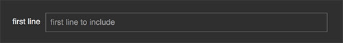
IntegerInput
An input to enter a number.
Example configuration:
{
    "placeholder": [
        "first line to include"
    ],
    "type": "IntegerInput",
    "id": "first_line",
    "tooltip": "This is the first line to copy",
    "label": "first line"
}
This will create the following widget:
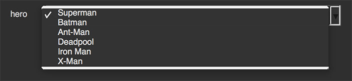
Dropdown
A drop down menu that contains a choice of values.
Example configuration:
{
    "type": "Dropdown",
    "id": "hero",
    "tooltip": "Choose your hero",
    "label": "hero",
    "values": [
        "Superman",
        "Batman",
        "Ant-Man",
        "Deadpool",
        "Iron Man",
        "X-Man"
    ]
}
This will create the following widget:
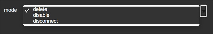
HandleDropdown
A drop down menu that inherits from the custom Dropdown widget. You don’t need to specify any values; It contains all the choices that are offered to handle nodes: delete, disable, disconnect.
Example configuration:
{
    "type": "HandleDropdown",
    "id": "mode",
    "tooltip": "Choose what to do with the nodes",
    "label": "mode"
}
This will create the following widget:
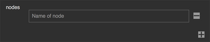
InputArray
An array of single line inputs. Clicking the + button creates a new input row. Clicking the minus button of a row removes the row.
Example configuration:
{
    "type": "InputArray",
    "placeholder": [
        "Name of node"
    ],
    "id": "nodes",
    "tooltip": "Process these nodes",
    "label": "nodes"
}
This will create the following widget:
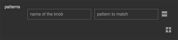
InputArrayDouble
Similar to the InputArray but this widget contains rows of two inputs. This widget is able to store and process lists of two elements per list under the hood.
Example configuration:
{
    "type": "InputArrayDouble",
    "placeholder": [
        "name of the knob",
        "pattern to match"
    ],
    "id": "patterns",
    "tooltip": "The pattern to match on the given knob name",
    "label": "patterns"
}
This will create the following widget:
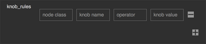
InputArrayQuad
Similar to the InputArray and InputArrayDouble but this widget contains rows of four inputs. This widget is able to store and process lists of four elements per list under the hood.
Example configuration:
{
    "placeholder": [
        "node class",
        "knob name",
        "operator",
        "knob value"
    ],
    "type": "InputArrayQuad",
    "id": "knob_rules",
    "tooltip": "The knob rules that must match",
    "label": "knob_rules"
}
This will create the following widget: